
I wanted to share with you my latest painting for my North York Moors project and in particular the process as it has been quite a tussle at times as I tried some new techniques as well as deal with the scale of this work. I also wanted to ensure that as it would be a statement piece for the exhibition, This Diverse landscape, that it would be recognisable as the landscape I have walked whilst still retaining the atmosphere you have come to know in my paintings.
The inspiration
Unusually for me I used reference material to start off with. This was mainly because I wanted to capture a particular day that I was on site walking around Danby. The day itself was changeable in terms of the weather but inspiring with lots of light (and rain!) which dazzled on wet surfaces giving the impression of the roads becoming rivers.
On this site visit I was so aware of how much water was running off the moorland and down into the rivers. Moorland that had recently been burned back and was not capable of holding or slowing down the water and river banks which had been reinforced to hold back rising waters. Learn more about the importance of our moorland through the Moor to restore project.
It was the wetness of this day which inspired me to adopt the blue-ish theme to the painting rather than replicate the colours in front of me.

Getting started
As with all my paintings I like to start off with making some marks, even if those marks are going to be covered up completely. It's a bit like a warm-up but also helps avoid any procrastination that being faced with a large white surface can induce. Getting those marks down feels like getting started, preparing for the long run.
I'd bought some Wallace Seymour drawing stones a few years ago and other than my sketchbook they'd not really had much of an outing. I'm a big fan of the Wallace Seymour range of oil paints and you will fine a range of their colours in amongst my oil paints.
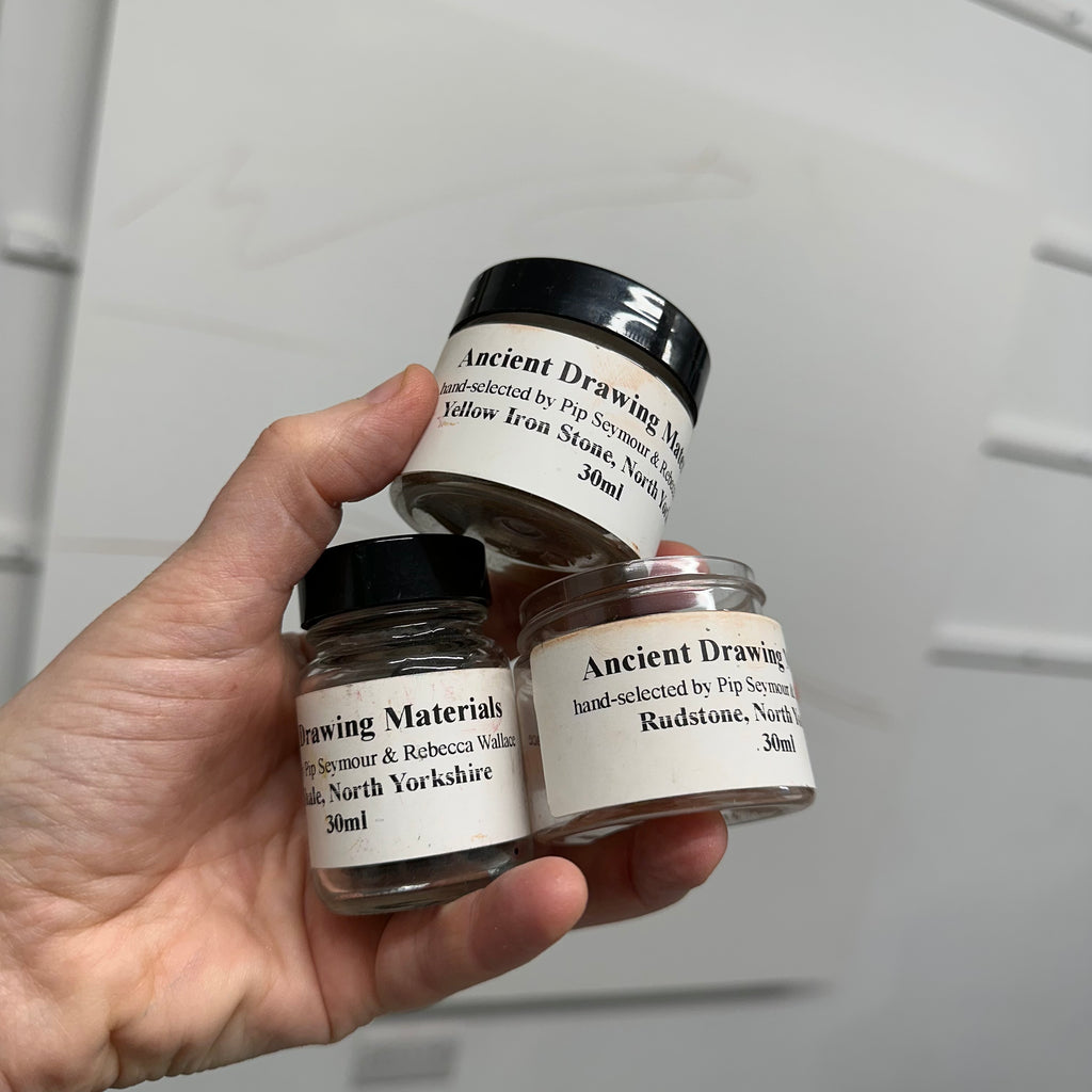
I thought it would be wonderful to use drawing stones which originated from the North York Moors and I set about carving up my large 122 x 122 cm deep cradled board. I supplemented the marks with some R&F pigment sticks in black and a mars red.

Once the marks were down and I roughly knew how I was going to carve up the painting I then started with adding a nice bright base colour. I also started blocking out and defining my shapes.

Colour palette
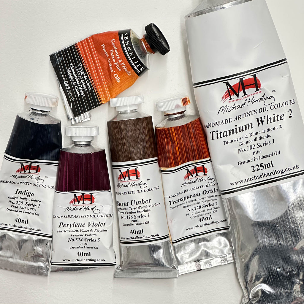
I choose the following colours for my palette which were heavy on the red side but the indigo blue provided a really lovely range of cool blues once mixed with the titanium white and some burnt umber. I really like this palette as it does create some beautiful colour mixes and plenty of darks.
Experimenting
Once the initial blocks of colour and shapes were in places I started to play around with letting the paint run and allow it to create interesting, organic marks to work with.

I then set about putting the details into the sky and ensuring there were lots of movement and some good bright areas in the painting.

Building up the land was challenging and quite a tussle between trying to keep the painting looking atmospheric whilst also ensuring it was recognisable as the place it was based on. The lines: dry-stone walls; hedgerows; roads; pathways; rivers, were an important part of the painting as it illustrated the range of visible boundaries in the area. They would also provide a feeling of perspective and distance in the work.

I used glazes of colour to harmonise the painting and ensure that the colours worked together. In doing this I lost some of the brights so kept working in to the painting to make sure I didn't lose the brightness in the top left hand of the painting.

I didn't like how the painting was tightening up which was mainly because I was focusing too much on reference material. I started to mess it up a little by allowing more of the paint to run and create some interesting marks and shapes to work from.

This did create some interesting effects but also quite a mess that I needed to pull back from. I started working into the painting with some gold to complement the copper which I had already embedded into the foreground. This helped to bring back some of the brightness to the paint as well as suggest areas for using gold leaf for some further line work.
Resolving
I worked into the painting and quietened down some of the marks and dribbles. They are still part of the painting but not shouting as much and create some nice contrasts between all the different marks.

In doing this I started to lose contrast again so built it back up which soon helped to create depth to the painting and started to pull it together. It's at this stage of a painting where I am finding opportunities to paint in pathways, rivers, roads and feels almost like discovering a new landscape.

I added more details and used gold leaf to trace boundaries and flashes of light colours to suggest a river or wet road.

I kept the foreground without too much detail as there was already a lot of texture from the marble dust I had used. Instead I used gold leaf and scratched back to the orange base layer to create interesting marks and pops of colour which tied in with the rest of the painting as well as an earlier painting Burn back.

And after months of tussling the painting very quickly came together. It was almost as if I couldn't believe it was done as I left it resting a few weeks before I added some linseed oil to bring out some of those darks.

I've put together a work in progress video so you can get more of a feel for all the different stages this painting went through. Lots more ugly stages than I've shown in this blog that's for sure!
The next stage will be to have the painting professionally photographed and colour matched so that I have a good image of the painting for my records and also as I intend to create a limited edition print of the painting ready for the launch of the exhibition in May 2024.
This Diverse Landscape
Saturday 18 May – Sunday 14 July 2024
Inspired By... Gallery, Danby Lodge, North York Moors National Park
The North York Moors is a place of diverse landscapes of moorland vistas, the endless horizon of the North Sea, rugged coast, sweeping dales and picturesque villages.
This exhibition is an artist’s emotional response and interpretation of these diverse landscapes and changing climates, light, altitudes and terrains.
From leafy lush grassland to the vast open spaces of the moors and unpredictable sea where solitude can be found and an artist’s journey can begin.